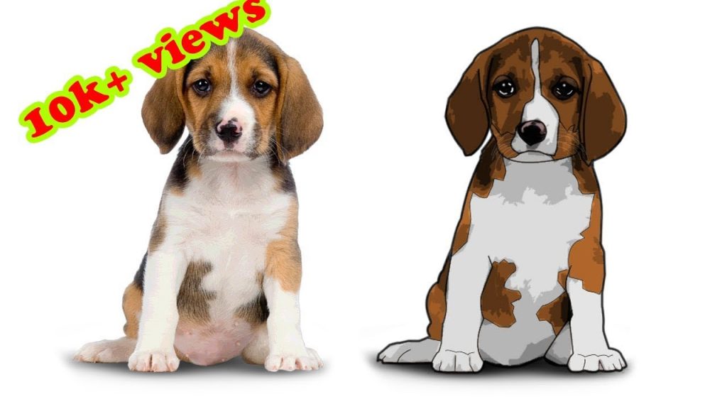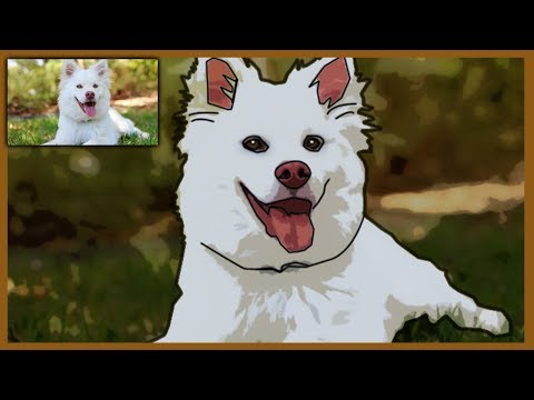
The first thing you’ll need is a high-resolution image of a person that you want to turn into a cartoon. The image should be clear and sharp with good detail and fairly flat skin tones. Don’t worry too much about the background, as you’ll get some unexpected but interesting effects with objects behind the person. But just make sure your subject has well-defined facial features without excessive contrast (no heavy shadows). These shadows may not translate well into the cartoon effect techniques explained here.
1. Open your image in Photoshop and immediately duplicate your background layer by right clicking it in the Layers Palette; then choose Duplicate Layer from the pop-up menu. This protects the original file from being accidentally destroyed or getting otherwise discombobulated.
2. Next, you want to reduce skin textures and smooth out your image using Smart Blur. At the top of the Photoshop window, navigate to Filters>Blur>Smart Blur. The dialog box that pops up presents you with four primary options including Radius, Threshold, Quality and Mode. The best way to find out what these options do is to just play around with them (as with most all other filters in Photoshop), but for now, the following values will work reasonably well for this step:
- Radius: 19.8
- Threshold: 31.4
- Quality: Low
- Mode: Normal
3. Next, we’ll adjust the contrast. This can be quickly accomplished as a Levels adjustment. Plus, it’s cool to use, because it looks like something Dr. Who would use to calibrate time travel. You can access the Levels adjustment quickly with the shortcut Ctrl + L or navigate to Image>Adjustments>Levels. You don’t want to go crazy with the contrast, but you do want to increase it enough that the image has flat skin tones with very little detail, but still has strong, recognizable facial features. Drag the black slider to the right to lighten the image and drag the white slider to the left to darken it. Don’t mess with the middle slider in this project; that’s for mid-tones, and right now we want to enhance the highlights and contrast.
4. After adjusting the contrast, make a duplicate copy of this layer by right clicking and selecting Duplicate Layer. Take care not to duplicate your original background layer in this step.
5. In the tools panel, set your foreground color to black and background to white. Then, working with the duplicate layer, navigate to the Filters menu again, select the Filter Gallery. Chances are good you’re already familiar with the plethora of artistic toys in this gallery, but resist temptation and go straight to Sketch>Photocopy. You might have to play with the Detail and Darkness sliders to find the optimal settings for your image. If anything, you will probably have to bump these settings “up” slightly to get a workable outline image from the Photocopy Filter.
The Photocopy image this gives you should resemble a pencil-drawn sketch. You may want to use the Eraser or Brush tools to clean up some of the skin and especially the facial areas. The amount of work you have to do here really depends on the quality of the original image you’re working with, in terms of skin tone and texture.
6. Making sure you have this topmost layer selected, set it to a blending mode of Multiply in the Layer Palette. You’re getting closer now, as your image should have cartoonish features; but you’re not quite there yet. The next step is to create a more convincing color palette for your cartoon portrait.
7. Select your first copy layer from the Layer Palette. This should be the “middle” layer out of the three total layers you have in your palette. Navigate back to the Filter Gallery and choose the Cutout option from the Artistic Filters. Adjust the sliders for this tool as needed so you achieve a fairly detailed image without it becoming too simple or losing its color saturation.
8. Using that same layer, go to the menu bar and select Filter>Sketch>Halftone Pattern. For now, just leave the settings at their default, which is usually:
Halftone Pattern Size: 1; Contrast: 5; Pattern Type: Dot.
As you adjust the sliders, you increase or decrease the size of the dots. Large dots will give you a retro effect, although your original photograph should be fairly large to be able to pull this off. You’ll probably want something midway, such as the defaults above.
9. With this ‘halftone’ layer still selected, hit Command + Ito invert the image. Then change the blend mode to Linear Light in the Layers Palette.
You may want to adjust the opacity of some of the layers to get a softer effect. Just remember that the top layers take precedence over the layers underneath, so start from top down
10. Now, you might want to add in a “thought balloon” so it really looks like a comic. The quickest way to add either a balloon or a “talkie” is to type in “Thought Balloon free clipart” in Google, hit Images, and you’ll see a huge variety you can right click and save to use.
The difference between a balloon and a talkie is a person thinking or saying something out loud, like this:
You’ll need to remove the background unless you were lucky enough to find a PNG with an already transparent background.
11. Next, open the image of the balloon or talkie (we’ll just call it a balloon from here on out) in Photoshop. Go back to your newly created cartoon, and be sure the top layer is selected. Then, back to your balloon image. Go to Layer>Duplicate Layer and a dialog box will appear asking where you want to send this layer, which, of course, is your balloon. Choose the name of your cartoon file and BINGO! Your balloon is on top of your comic.
12. You many need to flip the balloon or rotate it a bit so it looks like the words are coming out of your subject’s head or mouth.
13. Using the Type Tool, start typing in your balloon. A good font to use that comes bundled with most computers is Dom Casual, but, pick whatever one you like. Adjust the size and leading to fit and break the text as needed. You can choose to center the text, or use left justify and manually space the characters (it can be tricky to get them just right). Also important for a genuine effect is to bold some words, italicize others and even increase the size of a few for that dramatic, cartoony look. See the example below.

